english-for-designers
case study - museum Van Gogh
How can I make it simpler, but still creative?
🟡 Project Overview
This project is a design of a modern website for a fictional Van Gogh Museum. The goal was to create a clear and engaging experience that presents Vincent van Gogh’s life and work.
I wanted the website to feel as thoughtful and emotional as the artwork, while still being easy to use.
Users can explore artworks, exhibitions, and key information in a simple and natural way.
🔴 Problem
Many museum websites are hard to use. They often feel messy, outdated, or too complex.
Users often struggle to:
- find important information
- understand how the site is structured
- stay engaged with the content
Because of this, the digital experience often does not match the quality of the artwork.
🟢 Goal
The goal was to design a website that:
- is easy to navigate and helps users find key information
- guides users through the content in a natural way
- looks clean and modern
- keeps the focus on the artwork
🔵 My Role
UI/UX Designer – I was responsible for:
- research
- concept development
- wireframing
- visual design
🔍 Research & Inspiration
I reviewed several museum websites to understand how they work.
I noticed common issues:
- weak structure
- confusing navigation
- too much text
I focused on how to simplify the experience and make it easier to use.
🧠 Concept
The concept was to create a calm, gallery-like digital experience without losing clarity and usability.
I wanted to avoid overwhelming layouts and instead create space and focus.
The design aims to:
- feel like a real museum space without being overwhelming
- highlight artwork through spacing and layout
- use simple and warm visual elements
⚙️ Process
1. Analysis
I looked at how users interact with museum websites and defined key content areas:
- exhibitions
- artist biography
- ticket purchase
- contact information
2. Definition
I organized the content into clear sections and created a simple user flow:
- landing → exploration → action (tickets)
The goal was to make key actions easy to find and reduce extra steps.
3. Design
I translated the concept into a clear visual system.
I focused on layout, spacing, and typography to guide the user in a natural way.
🎯 Key Design Decisions
Layout
I used a grid to keep the layout clear and consistent. More space helps reduce clutter and improves focus.
Colors
I chose warm neutral tones to create a calm, gallery-like atmosphere. These colors support the artwork instead of competing with it.
Typography
I used a more expressive serif font in selected places to catch attention.
This font appears only on key elements, such as highlights or important headings.
For the rest of the content, I used a clean and readable font. This keeps the text easy to read and scan.
Imagery
Large images help create a strong visual experience and keep the focus on the artwork.
🧩 Design System
Grid
- 12-column layout
- consistent spacing system
Colors
- Primary: warm beige
- Secondary: light neutral tones
- Accent: dark contrast
Typography
- Creative heading: serif – Gastromond
- Body text and UI: Galano Grotesque
🖥️ Final Design
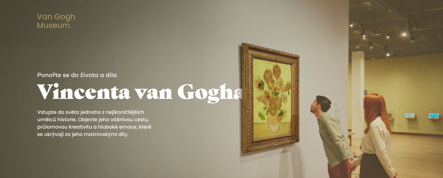
Homepage
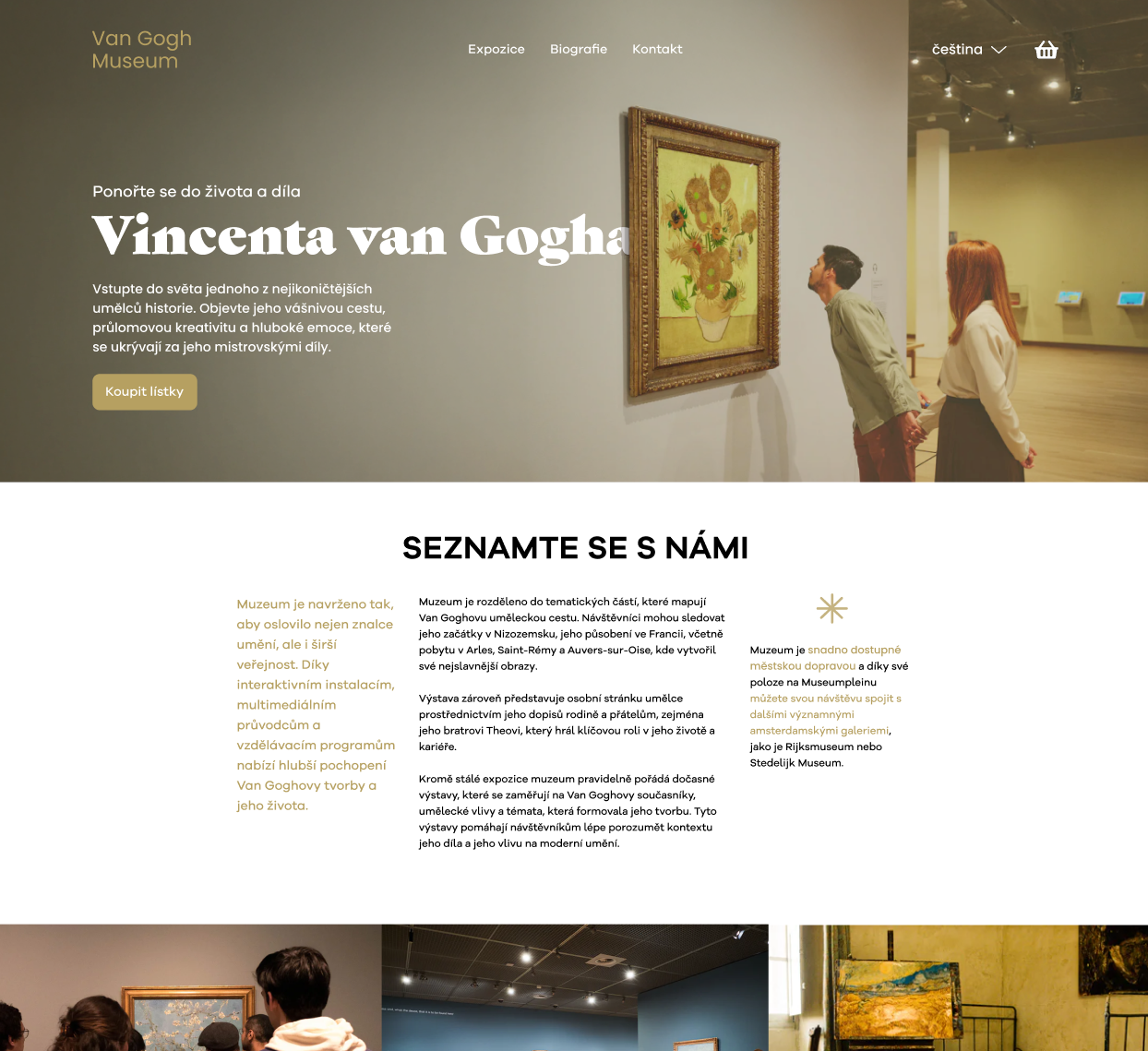
The homepage gives a clear starting point and introduces the museum.
Exhibition Section
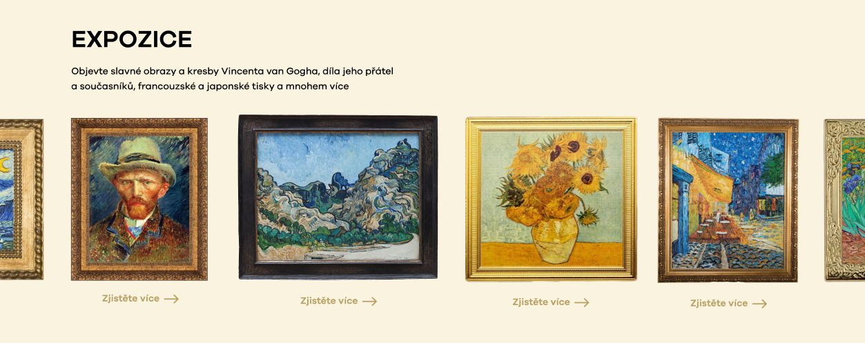
This section presents artworks in a clear and structured way.
Biography Section
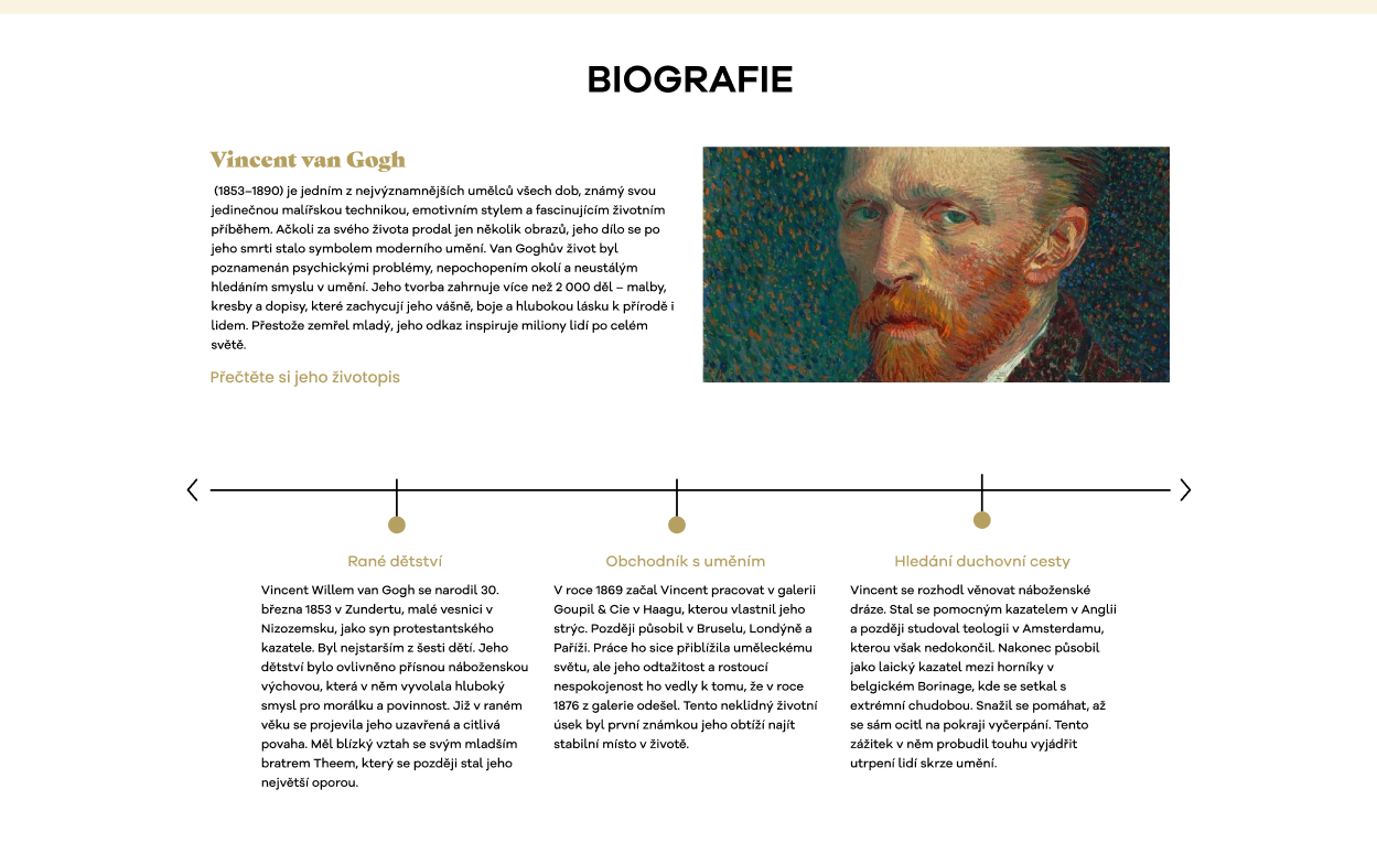
This section tells the artist’s story in a simple and engaging format.
🧪 Additional Screens
Overlay / Modal
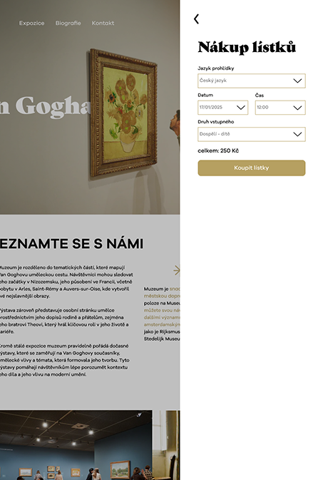
The overlay helps users choose tickets without leaving the page.
Users can stay focused and make a decision without losing context. If needed, they can easily return to the same place.
This keeps the experience smooth and reduces frustration.
After that, users move to a separate page to complete the purchase without distractions.
Form Design
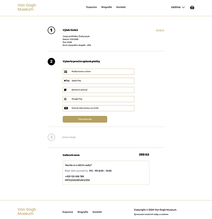
The form is simple and easy to use, with a focus on clarity and quick interaction.
💡 Reflection
This project helped me focus on clear and simple design.
I learned how to:
- structure content in a better way
- reduce visual clutter
- guide users through design
I also understood how important storytelling is in design. Every decision should support the idea and the user experience.
If I continued this project, I would test it with real users and improve accessibility.
📁 Tools
- Figma
- Adobe Photoshop
- Illustrator